
This week’s round-up of Gooseberry project work was a long one, clocking in at 1.5 hours. Watch and your reward is the full layout and animatic to date (a longer-than-final 17 minutes), livecast in full for the first time. Or, you know, just skip to the highlights below!
Hjalti made this layout of Tara’s first appearance…and disappearance (continuing on his scene from last week). But the director always has the final cut! Visit the Blender Cloud to see the latest layout for the entire pilot. (Or watch the weekly video above.) Recognize any of the stand-in voices from watching the weeklies?
In the full current version you’ll also find Sarah’s latest layout of Franck and Tara’s treetop talk to Franck’s final fall (the latter above).
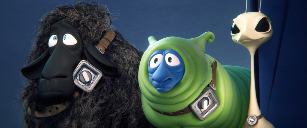
Manu has been testing timers…and now there’s even one for Tara! (These are based on real machines, btw, so happy hunting which ones…)
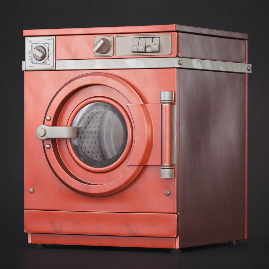
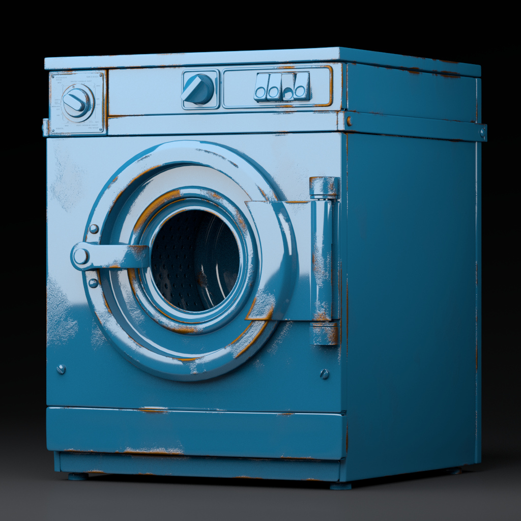
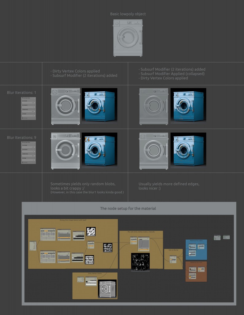
Here’s a hint: the machine model matches the timer. The one on the right has been put through some dirty vertex color testing to give it that rancid rusty finish. Curious about how that works? Manu made a handy graphical explanation:
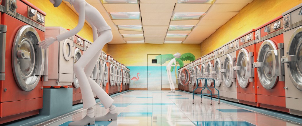
Manu’s also been adding to the full Cosmos Laundromat model: the new mural on the back wall makes everything more colorful!
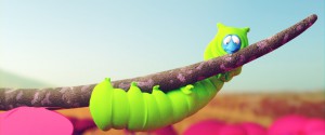
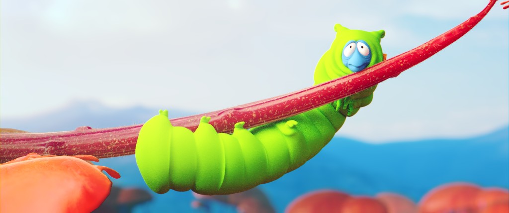
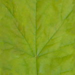
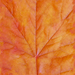
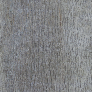
Despite some problems with random crashes, Pablo churned out a few renders and texture tests this week of caterpillar Franck and his jungle foliage.
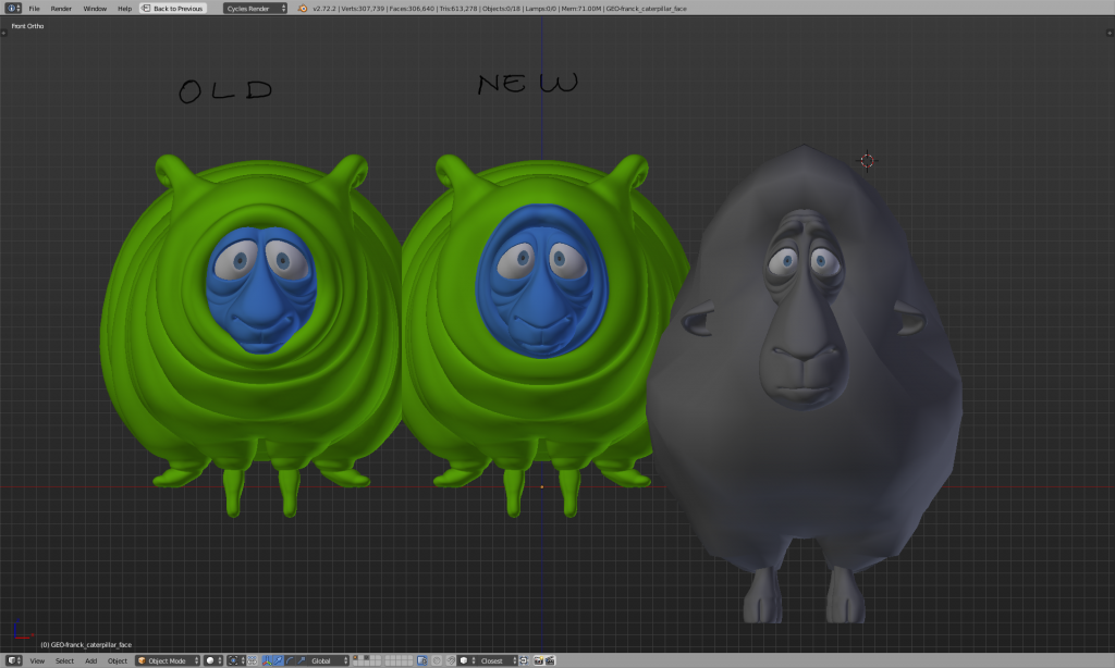
Sarah also spent some time tweaking Franck’s caterpillar face to make it even more similar to his sheep face — audiences should be able to easily pick out Franck throughout the movie, whatever form he takes.
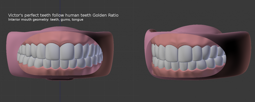
Angela modeled some perfect human teeth for Victor…which Sarah and Hjalti now want to subtly rough up a little. (Remember, Victor is supposed to be very, very old, and he’s definitely been put through the ringer of life!)
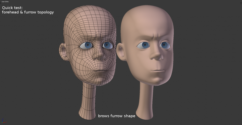
Angela also spent the week playing with the topology of Victor’s face. Check out some of his expressions using the new topology above.
It turns out it’s kinda difficult to model the fused tree roots Sarah had designed for the jungle world. So Sarah spent some time this week working up a solution using a skin modifier. Voilà!
Lukas continues to experiment with Franck’s fluffiness by adding more resistance to curly strands of hair and placing them in a virtual windtunnel — that would be the after on the right, of course.
Lukas also experimented with how to make more realistic grass fields (for the island) more quickly. His solution was to use dupli for faster rendering: first he created detailed patches of 100 strands of grass, then combined these into bigger “blobs,” which he could then clump around a full field for realistic waving in the wind.
For Antony, last week was “widget week.” In his lamp experiment, he manipulates overlapping spotlights cast by the lamps of his choice. Next, he uses a camera in a landscape model to capture the depth of a shot (the yellow marker is a new widget marking the camera’s current depth of focus). Finally, the node-viewer widget shows your model in the backdrop. (The first two widgets have been incorporated into the Gooseberry branch, with the third to follow soon.)
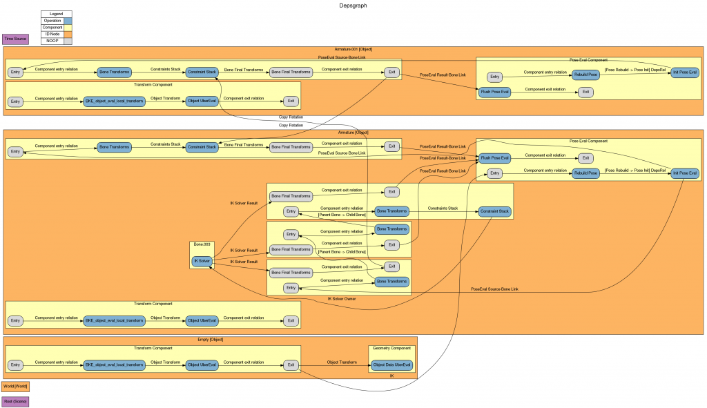
Sergey continued his work on dependency graphs, demonstrating in the livecast (around 1:17:00) how he’s speeding up the interaction of interdependent armatures. Move one, and now the other moves instantly. Plus he made this flowchart showing what’s going on (click on it to see a bigger version).
Pablo and Francesco played with folder structures, setting up a folder system above for production to track files more easily. (BAM! should name the files automatically.)
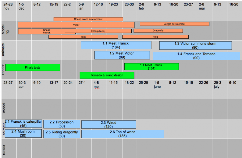
Ton also worked out a new production schedule to put this new folder structure (and numbered scenes) to use.
Curious as to who’s carrying this all out? (And who exactly those people are in the livecast, or not in the livecast, every week?) Elysia has put together a new Team page for this site with bios for everyone involved in the project so far!
So…any questions? :-)
love the color pallete on the laundry scene!
Lots of amazing work being done here. Congrats and thank you, Gooseberry team!
Elysia, you are doing a great job!
Thank you very much so far!
Just a question. Why not keep the same shader of the caterpillar ???
sorry for my English :)
Hey ! Well the caterpillar renders are very rough renders. UV’s ar not done, the mesh is not final (no shapekeys or facial expressions yet, no inside of the mouth…) so the shaders, textures and render is very rough, just to visualise where we’re going :)
lot’s of spectacular images, but for me the development is most exiting! If I may ask, are the new widgets going to be implemented for basic modeling tools as well? I remember that being a proposal to better implement the toolbar tools eg. the tools in the toolbar would toggle a widget instead of immediately calling the operator.
Shoot, so that’s that one suppesos.
Awesome ! Really interesting stuff . Look for more from you guys ! Thank you
Fantastic blog report Elysia, keep up the good work. Those wireframe images are really a great help for my personal projects. Thanks!!
Amazing development indeed, and very nice reports too. :)
Great work guys! Love the hair stuff!