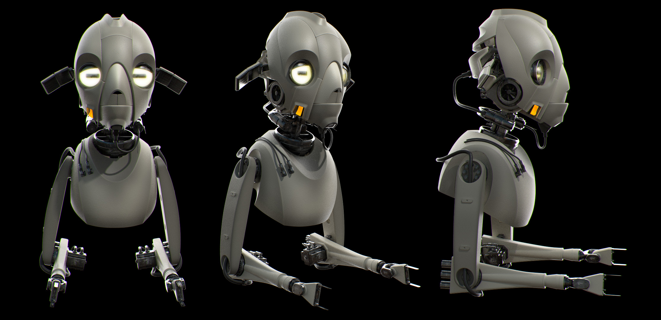
CG Cookie was assigned the robotic manifestation of Gooseberry’s sheep protagonist. At first glance, the shot seemed straight forward enough. But it didn’t take long to realize how difficult it would be to inject sheepish characteristics into a mechanical design.
 Our initial approach was very different from the final design. Perhaps our crew had a “Transformers” itch that needed to be scratched, but the first storyboard and concept sketch leaned heavily toward hard-edged complexity with a strong emphasis on the character’s silhouette. The idea was that Michel’s silhouette would read as a sheep at the beginning of the shot up until the lights turned on to reveal this crazy looking robot!
While Tim Von Rueden’s sketches got us all excited, upon review Mathieu reminded us that the character design needed more story-driven intention behind it.
Fueled by Mathieu’s feedback, our next design was literally a robotic sheep. On one hand this was closer to the right track, but it went a little too far the other way. So initially, our design inspiration was too much “cool-heavy-metal-explosions-YEAH” and not enough purpose. The next design was too much literal purpose and not enough cool.
Third time’s the charm, right?
Due to the expedited production schedule of the teaser, we had to accelerate the design process. So I took all the directorial feedback from Mathieu and jumped right into Blender to finalize our design in 3D. Thanks to dynamic topology, I could quickly hammer out our ideas in digital clay which offered a much more accurate representation.
Everyone was much happier with this new direction so we moved forward with modeling. Again, due to the compressed schedule I had to brute-force my way through the process, hacking together a barely riggable torso model. I want to especially thank BlendSwap user menagy for his insanely detailed KUKA Robot that I used for Michel’s arms, which unfortunately didn’t make it into the final shot.
With the materials I employed as many procedural techniques as possible to achieve commodore-64-esque body panels overlaying black metal internals.
We then passed Michel’s model off to Juan Pablo Bouza who used his extensive toolkit to rig the character while Jonathan Williamson built the background environment. Hjalti Hjalmarsson brought the character to life with animation and it was off to the renderfarm. After a full day of rendering, the shot was finalized in the compositor.
One of the best take-aways from any project is what you learn along the way. And this project wasn’t any different – We learned a ton! I’m so excited to see how Gooseberry is going to advance and further mature Blender as a production-ready creation suite. Please support it!
Awesome little animation! great and subtle acting ! defenetly love it
Hjalti really did an awesome job!
Essasú?
very nice work in every aspect i can think of.
Thanks for the great insights into the creative process that went into the making of the trailer. Keep going! :)
Great stuff, every aspect up to quality. Great to see the build images, thanks. Very impressive.
Though I just have to say… C’mon Gecko!!! It will be great to be writing how great a British team are.